Discovery | Design System
The Opportunity
With the acquisition of Scripps Networks, Discovery’s Digital Product team has scaled nearly three times in a single quarter. With such rapid growth and a sudden shift to a pod-based agile development process, the need for consistency, efficiency, and alignment between designers spread across cross-functional teams became essential.
My Role
I co-led the development of Discovery’s first Design System in support of a new direct-to-consumer streaming product for Mobile and Connected TV devices. I conducted research and a team-wide audit of existing designs, established a unified type ramp, defined a color palette, built a master suite of iconography, implemented a grid and spacing methodology, and built a full Sketch UI component library.
The Challenges
Development was planned to begin two weeks after the Design System initiative was kicked off, which left very little time to fully audit and standardize design elements. Multiple designers working in silos across multiple teams made for a large number of disparities across all screens that needed to evaluated and unified.
Guiding Tenets
Efficiency: Working within the established patterns seen within the system allow designers and engineers to work more quickly with less room for error
Clarity: Elements of the design system clearly communicate engineering specifications and in an easily accessible and consumable format
Flexibility: The system is adaptable to accommodate development of new features while reducing the need to introduce new or unnecessary styles
Research
Comparative evaluation of existing design systems, tools, and workflows from other organizations
1:1 meetings with designers to evaluate current sketch workflows and third party tools
1:1 meetings with engineering leads to understand their needs and formatting of information to be easily consumed by working teams
Design Audit
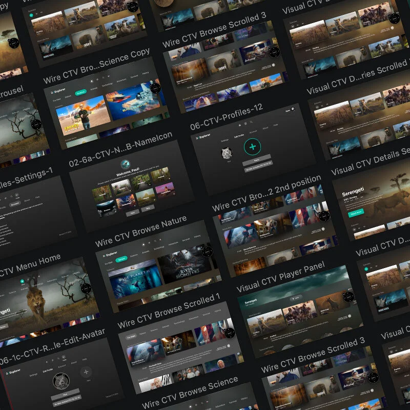
Review of dozens of sketch files containing ui and layouts from the entire team
Deconstructed all UI into common core components
Identified unnecessary one-off styles
Organized all UI elements by component type and use case
Type Ramp
The audit yielded an overwhelming 60+ type sizes and styles.
Identified close commonalities between some of the more redundant styles
Reduced type ramp to a core 14 styles that accommodated all existing needs across CTV and Mobile.
Remapped styles to the structure/nomenclature used within the existing engineering framework
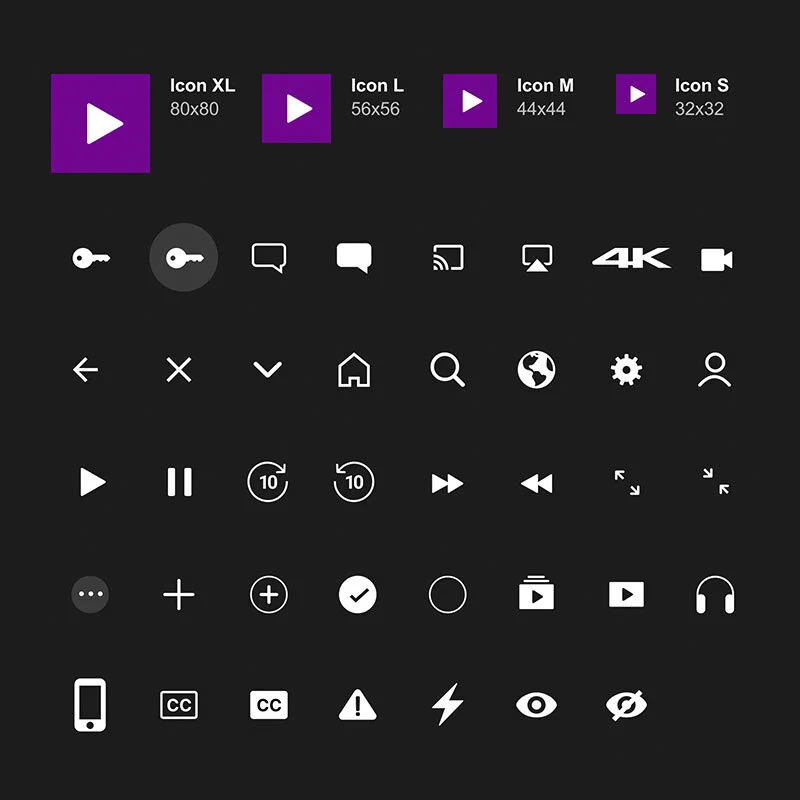
Master Icon Suite
Unified the styling of the vector icons and created a master suite of all icons.
Built a means for designers to easily drop them into presized containers and change colors as needed in Sketch.
Color Palette
The audit yielded more than 30+ colors being used inconsistently throughout the experience.
Color palette was distilled down to a set of (4) brand colors, neutral colors, along with guidelines on how to use them effectively
New color palette was also tested for accessibility
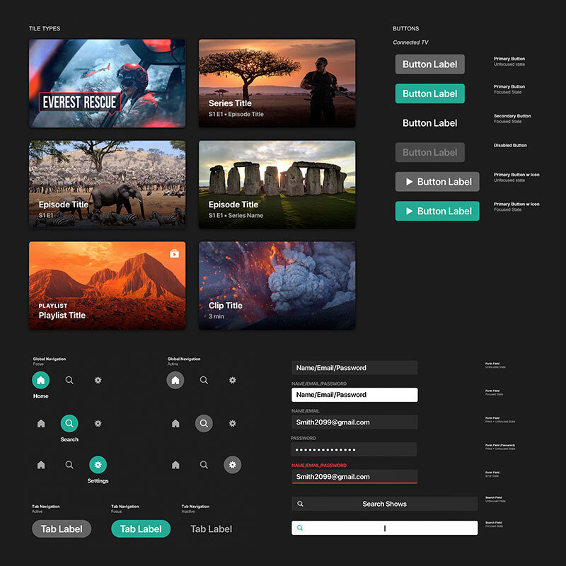
Complex Components
Complex components built with all states
Components such as buttons, form fields, navigation states and most commonly used text lockups created
Built in sketch as adaptive shared symbols.
Final Outcome
The Design System was built in Sketch and delivered to the Design team for pressure-testing and quick iteration as needed.
With designers now armed with consistent componentry and styles in Sketch, the team was able to deliver polished screen designs for the full end-to-end experience within a single two week sprint.
The system was uploaded to Zeplin, along with final screen layouts, and was shared with engineering for reference when building out new components and screen layouts.
Reception from Engineering was overwhelmingly positive, as it enabled them to establish global styles and patterns. It ultimately increased development time and reduced redundancy of work
Future Evolution
Extend the design system to responsive web, an upcoming initiative in Q1 2020
Leverage this new design system to serve the needs of the 15+ digital products from the multiple brands under the Discovery umbrella
Continue to add and iterate upon the system as new features and layouts are added to the experience per the 2020 roadmap


