Concept
VICE wanted a more engaging means to offer users bonus content to compliment their news segments while streaming in the HBO desktop and mobile app’s video players. The concept: Give viewers “news they could touch”.
My Role
I led the design and development for this feature from end to end; collaborating closely with Product Management, a junior UX Designer, UX Research, and Engineering.
Challenges
Limited engineering resources available for this feature. VICE also could not commit to providing us with any content for QA testing until two weeks before launch.
Guiding Tenets
Seamless: Secondary content compliments the primary video; it does not distract from it
Flexible: Bonus content is not limited to video clips; multiple content are types supported
Interactive: Users feel connected and able to engage with and control secondary content directly
Contextual: Secondary content relates to specific segments and is offered to users at relevant moments
Scalable: The feature is program-agnostic; built as a larger framework that could be leveraged by other HBO programs in the future
Content Types
We worked with VICE to identify expected bonus content types. After interviews with producers, we narrowed down and categorized contents into three buckets:
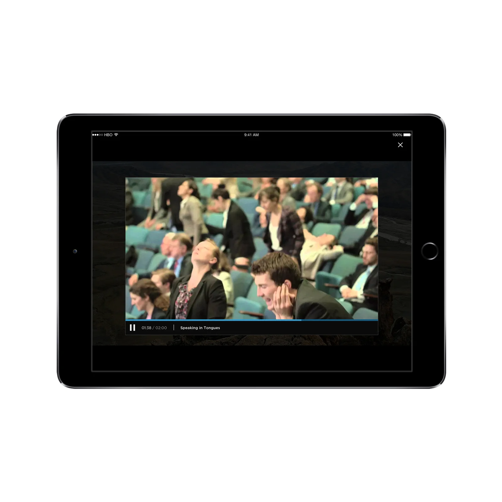
Secondary Video: Short, supporting, supplemental video clips related to the segment
Infographics: Interactive charts, graphs, and diagrams that users can control
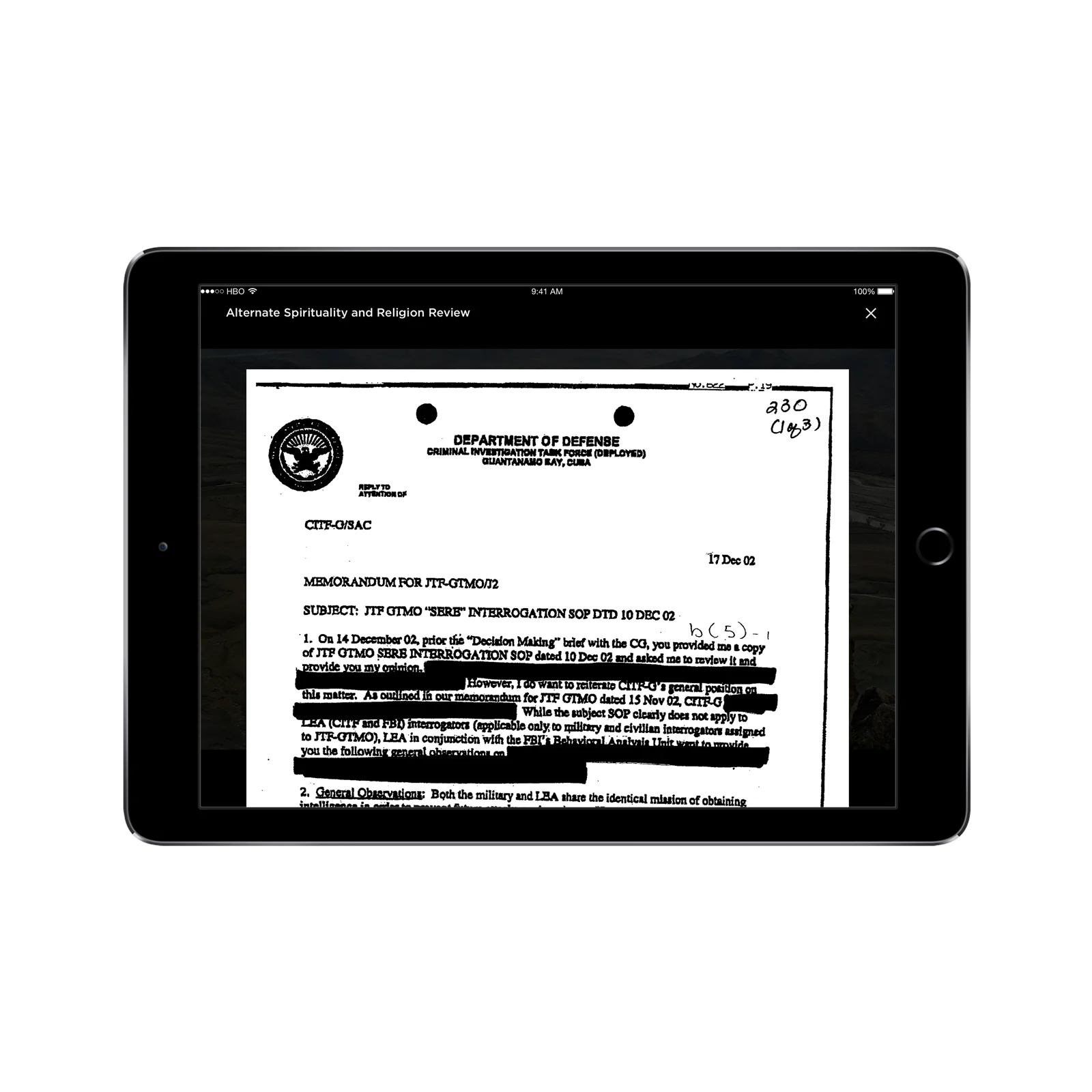
Documents: Full detailed sets of documentation supporting the respective news segment
Process
Ideate > Prototype > Test > Iterate > Prototype > Test > Build > Release
Initial concept sketches
Annotated wireframes, user flows, etc
Prototype
User Testing
Key Screens for User Testing
Interactive CTA Button appears in top right of the screen at specific points during playback. User can tap to access secondary content.
A miniature player with limited controls for short video clips. Upon completion, user is automatically returned to the main video
Overlay with iframe support for any custom interactive content that VICE can create and host off-platform
Overlay with document viewer
Primary Test Results
While the general concept performed well during user testing, and the secondary content was seen as useful, there were key areas in need of improvement:
User Education: Users did not immediately recognize or understand the purpose of button that appears during key segments during the video
Perception of Interruption: Users perceived the indicator dots on the timeline representing when interactive content was available as paid advertising
More Upfront Context: Users wanted more upfront awareness of what bonus content was available to them for the entire playback session vs. being surprised
Choice to Revisit Content: Some users thought the additional content was helpful, but wanted a means to access it at any time other than scrubbing the timeline to trigger the button in the UI
Deactivate Feature: Some users liked the concept but ultimately wanted the ability to turn it off if they were more ‘lean-back’ vs. ‘lean-in’ viewers
Iterative Improvements
Coachmarks added to help users recognize iconography and interactive UI elements. This screen appears only once per user’s logged in session to avoid an impediment to playback for users revisiting night after night as the show aired.
New menu was added so users can access bonus content at their discretion. Indicator dots were changed to only appear when the menu was open to decrease perception of paid advertising. More visual styling applied to active secondary content when player controls were visible to help orient users.
Final Results
After a second round of user testing, which addressed all previous issues successfully, the final feature was built in earnest and shipped to users. The only user-requested feature, which was the ability to turn off the feature entirely, was de-scoped at VICE’s insistence.
VICE utilized this framework for interactive features for 2+ years before recently discontinuing due to the production lift associated with generating bonus content every day. The framework is currently in the process of being leveraged by other HBO news & talk shows.


