HBO | Catalog Content Reorganization
The Problem
The existing information architecture and editorial capabilities of HBO GO and HBO NOW kept key programming in silos, making it difficult for users to intuitively uncover the breadth of HBOs award-winning catalog. We sought opportunities to increase content discoverability.
My Role
I took on the role of UX lead mid-way through the initiative. I worked closely with 3 other UX Designers, another UX Lead, UX Research, Product Management, and Engineering. I also collaborated with various HBO stakeholders from Programming and Marketing to advocate for the initiative and gain consensus as the work took shape.
Challenges
The existing informational architecture was built in an extremely rigid fashion, so any effort to add flexibility required an engineering overhaul of how pages were built across all devices. There were also limited areas in the experience for Marketing to promote collections of content. Close stakeholder management and cross-departmental collaboration with other teams outside of the HBO Technology team became crucial to the success of the project.
Guiding Tenets
Flexibility: Users are given many different ways to discover content based on their various mental models while browsing
Scalability: The system is scalable and can support any number of new content types or genres as needed.
Consistency: Content is organized, labeled, and promoted identically across Desktop, Phone, Tablet, and Connected TV platforms
Curation: Users are presented with more opportunities to discover thematically grouped sets of content. HBO Editorial teams are given more areas and ways to promote content throughout the experience.
Research Efforts
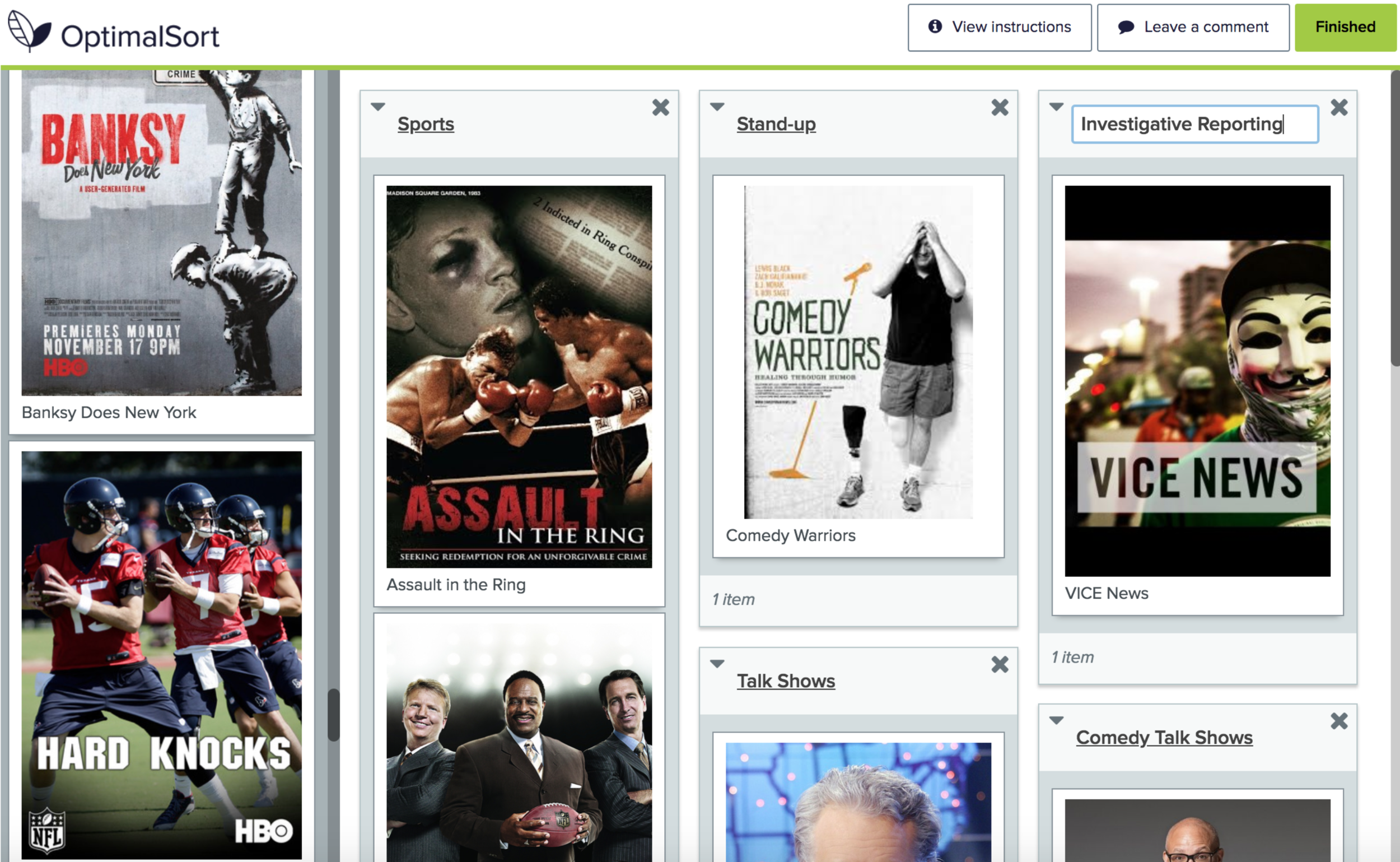
Card Sort View: Users sorted content into groups that were meaningful to them.
To propose a new content categorization, we explored ways users naturally group content. Using a card sorting exercise, participants were asked to categorize items from the HBO content catalog. Results informed that users mainly grouped content by:
Format (Movies, TV shows, Events)
Temporal (New, Coming Soon, Leaving Soon)
Genre (Action, Comedy, Drama, etc)
Results from navigation tree test for “Where would you find “Last Week Tonight with John Oliver”, a satirical news commentary show?
We simulated and compared different browse paths to learn which path increased discoverability. We learned that users all had different ways of classifying certain programs and different expectations on where they would expect to find them in our IA.
New Information Architecture
Due to the varying mental models of our users, the need to restructure our Information Architecture was essential to increasing discoverability. Some key improvements:
“Specials” as a main category type: Best suited for stand-up comedy, concerts, and other previously live events
Ten new genres introduced: Allows users to browse by genres that are better associated with how they perceive content classification
Genres now associated with all main categories: Previously limited to movies; genre tagging is now applied to Series and Specials
Content associated with multiple genres: Content can have many:many relationships vs. previous 1:1 relationship
Genre Landing Pages: Genres now have their own sections within the experience, adding additional entry points to content
Temporal Landing Pages : Landing pages based on timeliness of content; specifically “Just Added”, “Leaving Soon”, and “Coming Soon” as sections
New proposed IA with pathways introduced between all main categories and consumer genres
With the new IA, Last Week Tonight with John Oliver is now discoverable in 4 times as many places
John Oliver: New IA
Homepage
Series / Featured
Series / A-Z
Series / Comedy
Series / News & Talk
Comedy / Featured
Comedy / A-Z
Comedy / Series
News & Talk / Featured
News & Talk / A-Z
News & Talk / Series
Just Added / Episodes
John Oliver: Old IA
Homepage
Series > Featured
Series > A-Z
Greater Opportunities for Curation
A large part of this initiative was also focused on giving our partners in Marketing greater opportunities to showcase thematic collections throughout the experience. In the past the producers who schedule content on the service were extremely limited where they could apply their editorial voice, and had greater control over pages on some device types than others. Some notable improvements:
Platform alignment: Previously limited to a single grid per page, Phone and Connected TV experiences were given new component types to showcase collections of content.
Flexible page structure: A departure from previously hard-coded pages, producers could now build “Featured” sections for any category or genre entirely within our proprietary CMS


